
A framework for building games people want before they’ve played them.
Most indie games are dead before they’re built.
Not because of bad art or bad code. Because the developer asked the wrong question on day one, and every decision that followed was the wrong answer.
I have worked in art direction and marketing for video games. I’ve watched games with genuinely clever mechanics ship to silence. Games with no hook at all sell hundreds of thousands of copies. After enough of those outcomes, the pattern becomes hard to ignore.
By the end of this post, you’ll know exactly why it happens, and the one shift that changes everything. But first, you need to see the proof.
Your “But” Sentence Is Quietly Killing Your Game
Ask any new developer to describe their game and you’ll hear some version of the same answer: a hook. A mechanic that sets it apart. The magical “but“:
“It’s a city builder, but on a tiny island.”
“It’s a roguelike, but the enemies remember your past runs.”
“It’s a survival game, but the world is made of music.”
It sounds like a strategy. It gives you something clean to put in your game description. It feels like differentiation.
It isn’t. It’s decoration. And decoration doesn’t drive indie game appeal.
Two Games, One Developer, One Uncomfortable Result
Here’s the proof.
A developer released two games. The first; Makis Adventure, had a genuinely interesting mechanic: a platformer where you could transform into a shark. Novel. Memorable. The kind of thing that sounds irresistible in a pitch.
it didn’t sell.
The same developer later released Paddle Paddle Paddle. No remarkable mechanic. No clever twist on genre conventions. Just a small boat you paddle across treacherous levels with a friend. The capsule image tells you everything: two people, in a joined struggle to….Paddle.
You immediately want to be in that moment.
Paddle Paddle Paddle vastly outperformed the shark game. No hook. No “but.” Just a feeling people recognized and wanted.
The mechanic lost. The feeling won.
This isn’t a fluke. This is the pattern.
Players Ask One Question. You Have Three Seconds.
When a player first sees an image of your game they’re not comparing features. They’re not reading a design document.
Their brain is asking one question:
Do I want to be in that world?
Three seconds. One question. That’s your entire pitch.
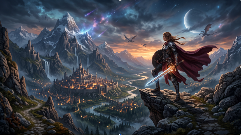
Consider Stardew Valley. Strip the mechanic to its bones: click to water plants. On paper, that’s nothing. You could pitch it in any meeting and no one would be excited.
But the experience, building a quiet life, tending something that grows, finding peace away from the grind, that’s something millions of people genuinely crave and rarely get to feel. The art reinforces it immediately: warm palette, gentle proportions, a world that looks safe and kind.
You understand the fantasy before you read a single word of description.
The mechanic is almost irrelevant. The context of the mechanic is everything.
I’ll show you how to build that context, but first, here’s the framework that explains why most teams get this wrong.
Four Pillars. Most Teams Focus on the Wrong Two.
Every game needs four things to succeed:
| Pillar | What it solves | The honest truth |
| Fun | Keeps players playing | Gets easier with experience |
| Appeal | Gets players to try it | This is the one that kills projects |
| Scope | Lets you actually ship | Chronically underestimated |
| Monetization | Keeps the lights on | Worry about this last (I have great news for you on this one) |
New developers almost always pour energy into Fun and Monetization. Fun because it feels like the core of game design. Monetization because bills are real.
Here’s what that costs them.
Appeal and Scope, the two problems that actually determine whether your game succeeds, get ignored until it’s too late. Both are shaped almost entirely by decisions you make before you write a line of code.
Appeal is making someone want to play before they’ve played. That happens through visuals first. Your cover image, your trailer, your screenshots, they’re doing all the selling before a single player touches your game.
Scope determines whether you ship at all. And your art style choice has more to do with scope than most developers realize until it’s too late.
If you’re publishing on a platform like RUN, this can be largely handled for you, which is one less reason to obsess over it early.
Before You Start, Write This Sentence
Here’s what I suggest you do first.
Before the engine. Before the prototype. Before you think about art style. Write one sentence. Not a genre description. Not a feature list.
A fantasy.
Thinking back at the most successful projects I have worked on, the fantasy was clearly described from the start. Not a mechanic. Not a hook. A feeling. A fantasy your audience wants fulfilled.
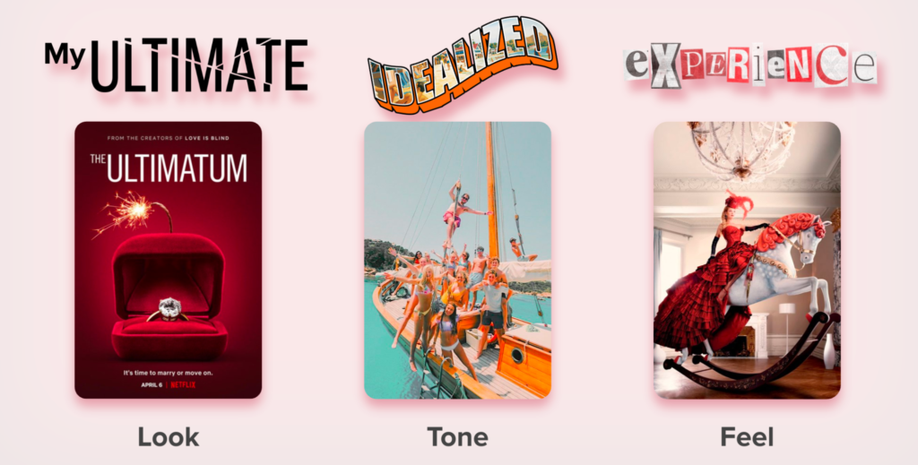
Here is an example we used during the development of the Ultimatum Choices game for Netflix
Everything will become clearer after you have written this sentence: the art direction, the reference games (or other medium), the scope decisions, which design questions matter, and which are noise. The fantasy will give the whole project a foundation.
Once you have a clear fantasy to fulfill, you can ask yourself: what’s the minimal system that actually delivers this feeling?
The fantasy comes first. The mechanic is the most efficient path to serve it.
Two Questions That Expose Whether Your Fantasy Is Strong Enough
Before you commit, run your one-sentence fantasy through both of these:
1. Can someone understand it in one screenshot?
Not a paragraph. Not a trailer. One image. If your cover art needs any explanation at all, the fantasy isn’t clear enough yet. Keep simplifying until it’s undeniable.
2. Does it make someone crave the experience?
A fantasy works when it taps something people genuinely wish they could do or feel, defeat hordes of enemies, fly through mountains, build an empire from nothing, climb a mountain with your friends. It’s an unsatisfied urge in the real world that your game promises to satisfy.
If people see your cover art and think “I want to be in that”, you have a fantasy.
If they think “that’s an interesting mechanic”, you don’t. Keep iterating or start over.
Every Visual Choice Now Has One Test
Once the fantasy is defined, art direction becomes simple: every visual choice must serve that fantasy.
If your fantasy is “survive in a brutal medieval world”, your palette should feel cold. Your UI should feel heavy and handcrafted. Your characters should look weathered, not sleek.
If your fantasy is “build a peaceful island city”, your palette should breathe. Your art should feel gentle and approachable. Every building should feel like something you’d be happy to stare at for an hour.
Misalign your art from your fantasy and the game sends mixed signals before anyone presses start. Players won’t know what to feel. When they don’t know what to feel, they move on.
Scope: The Question Most Art Direction Conversations Skip
Here’s one more thing that rarely comes up: can you make this art cheaply enough to be generous with it?
When you evaluate every content workflow with this in mind, be brutal in reducing scope If each asset takes minimal time to create. It means more content, which means more game, which means more value for players.
Be cheap so you can be generous.
This isn’t about cutting corners. It’s about making choices that give you room to breathe. Pick an art style you can produce a lot of without burning out, not the style you love most in theory, but the one you can execute quickly, consistently, and confidently.
Slots and Daggers proved that a cohesive simple style executed with energy will always beat an ambitious style executed with exhaustion.
Five Strategies That Build Real Indie Game Appeal
If the hook isn’t your strategy, what is? Here are five approaches that actually work, and what each one means for your art direction:
1. Iterate on Proven Formulas
Find something that already works and do it better. Mega Bonk combined Risk of Rain and Vampire Survivors. The demand is proven, you compete on execution.
Art direction: study what makes the reference game’s visual language work. Understand it deeply, then make it yours.
2. Own a Visual Gap
When Monument Valley was released, no one had used the hyper-minimalist puzzle space on mobile. They owned that visual territory before anyone else arrived.
Art direction: the gap is often aesthetic as much as mechanical. What visual tone is nobody else occupying?
3. Tap a Real-World Fantasy
American Truck Simulator is purely about… driving a truck… across America. That’s the whole game. When the real-world fantasy is appealing enough, the game inherits its pull directly.
Art direction: the visual style must serve the fantasy completely. Anything that distracts from it needs to go.
4. Translate Successful Media
Schedule 1 didn’t copy Breaking Bad, it captured the feeling of it. The gritty, morally complicated aesthetic does most of the emotional work before you read a single word.
Art direction: this lives or dies on how faithfully you translate the emotional tone, not the surface details.
5. Use Tech as the Fantasy
If you can do something visually or technically that nobody else can, simulate every pixel, render 10,000 enemies simultaneously, or turn your photos into battle cards like in PicMon, that capability becomes its own form of appeal.
Art direction: your art style needs to show off the tech, not fight it.
Five Steps Before You Open Your Engine
Here’s exactly what I’d tell a developer before they touch anything:
- Write your fantasy in one sentence. Not a genre. Not a mechanic. A feeling someone wants to live inside.
- Run the two-step test. One-screenshot clarity. Genuine craving. Fail either one, simplify and run it again.
- Choose an art style that serves the fantasy and that you can produce quickly. Both conditions must be true. Neither one alone is enough.
- Find your reference games not to copy, but to understand what visual language already exists in this space and where the real gaps are.
- Start prototyping only after steps 1–4 are solid and use the fantasy as your filter for every single decision.
When the fantasy is clear, everything gets easier. Scope becomes manageable. Art direction has a concrete test. Prototypes get targeted instead of sprawling.
Fantasy is the foundation.
No mechanic however clever, however novel, however memorable in a pitch compensates for a shaky one. Players don’t buy mechanics. They buy worlds they want to inhabit. Feelings they can’t get anywhere else. Unsatisfied urges they didn’t know they had until they saw your cover image.
Define that first. Build toward it relentlessly. Let the mechanics serve it.
Then ship.
What’s your game’s one-sentence fantasy? Drop it in the comments, I’ll tell you whether it passes the two-step test.
Key Takeaways
- Players don’t buy mechanics: they buy experiences, and your art sells the experience before anyone plays
- Define your fantasy first: one sentence, one feeling, one unsatisfied real-world urge
- Strong fantasies pass two tests: instant clarity in one screenshot + genuine craving
- Every visual choice must serve the fantasy: not look impressive in isolation
- Be cheap so you can be generous: pick an art style you can produce quickly and consistently (do you really need that many animations?)
Appeal and Scope are the hard problems: your art direction shapes both